Redesigning the scheduling tool When2meet to better meet students' needs.
Team: Engineering Manager, UX Designer (me), 8 Developers
Tools Used: Figma, Miro, Zoom, Google Survey, Google Sheets, Pen and Paper.
Duration: 4 months.
Responsibilities: I was the design lead for this project and my responsibilities included conducting competitive analysis on similar existing products, recruiting and running user interviews and surveys to understand how students use scheduling tools. I also iterated on designs ideas through lo-fi, mid-fi, and hi-fi wireframes and prototypes.
Background
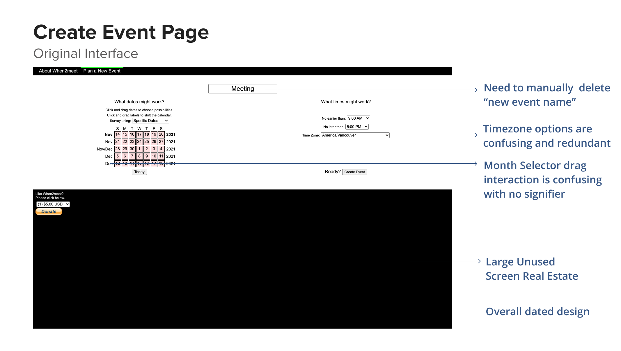
As students, we often have to schedule meetings for group projects or extracurricular involvement. The scheduling tool that we use most often is called When2meet. However, this platform isn’t the easiest to navigate. Thus, we wanted to iterate on When2meet and add more features to make scheduling meetings a less cumbersome process.
Challenge
How are students currently navigating the When2meet scheduling tool and how can we make the process more efficient and less cumbersome?
Research
The goal of this research was to understand the current scheduling tool market, evaluate whether there was value in iterating on the When2meet tool, and understand the existing problems and pain points users are running into in the scheduling process.
1. Competitive Analysis
In order to better understand the scheduling tool product space, I spearheaded the competitive
analysis on products similar to When2meet such as LettuceMeet, Calenderly, and Doodle. We
learned that while there are many scheduling services, most free tools had very basic or
minimal features and required the user to pay for advanced scheduling features.
2. User Survey
We then collected 78 survey responses which helped us understand how users currently used
scheduling tools and their context; as well as pain points they ran into and features they
would like to see.
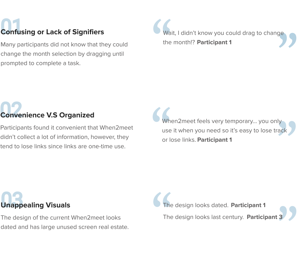
3. User Interview
After confirming that there are pain points in the current scheduling process, we recruited 4
participants through convenient sampling to run a semi-structured interview and usability test
on When2meet. We used an affinity diagram to analyze the qualitative data.
Research Insights
The goal of the user interview was to understand the existing problems and pain points users are running into in the scheduling process.
Synthetic Models
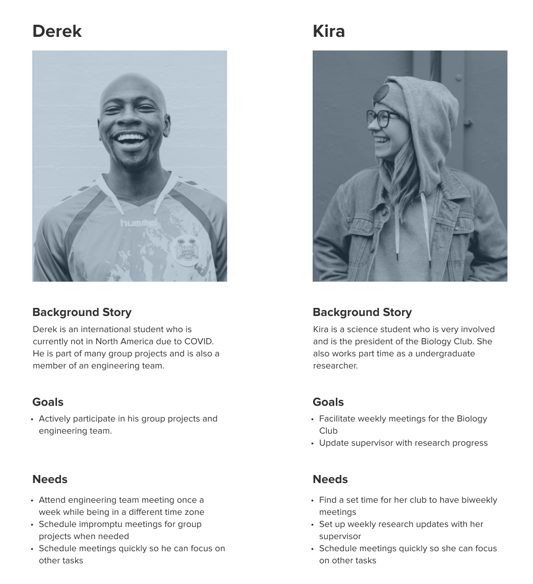
Based on the research data, I synthesized two personas to focus on in our redesigned version of the scheduling tool When2meet. We referred to these personas frequently throughout the design and development process to align everyone on the features we wanted to prioritize.
Design Principles
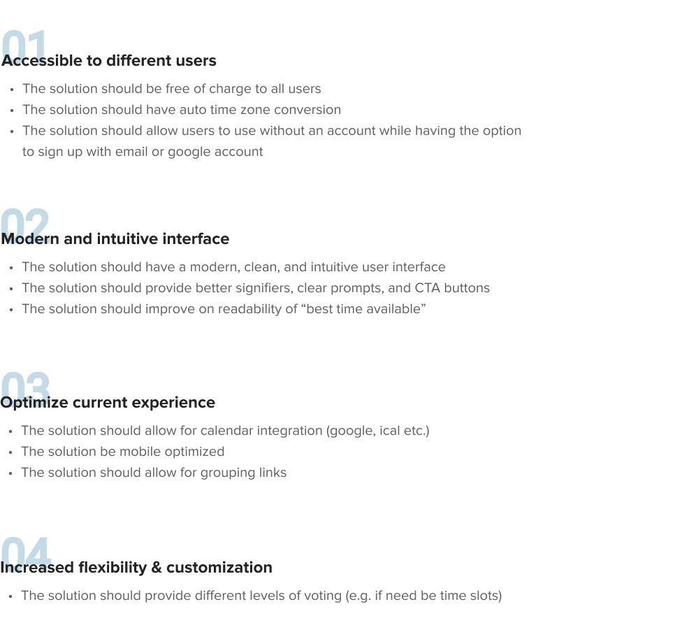
I consolidated the research findings and user pain points into key design principles our solution would follow. This made communicating with and engineers easier.
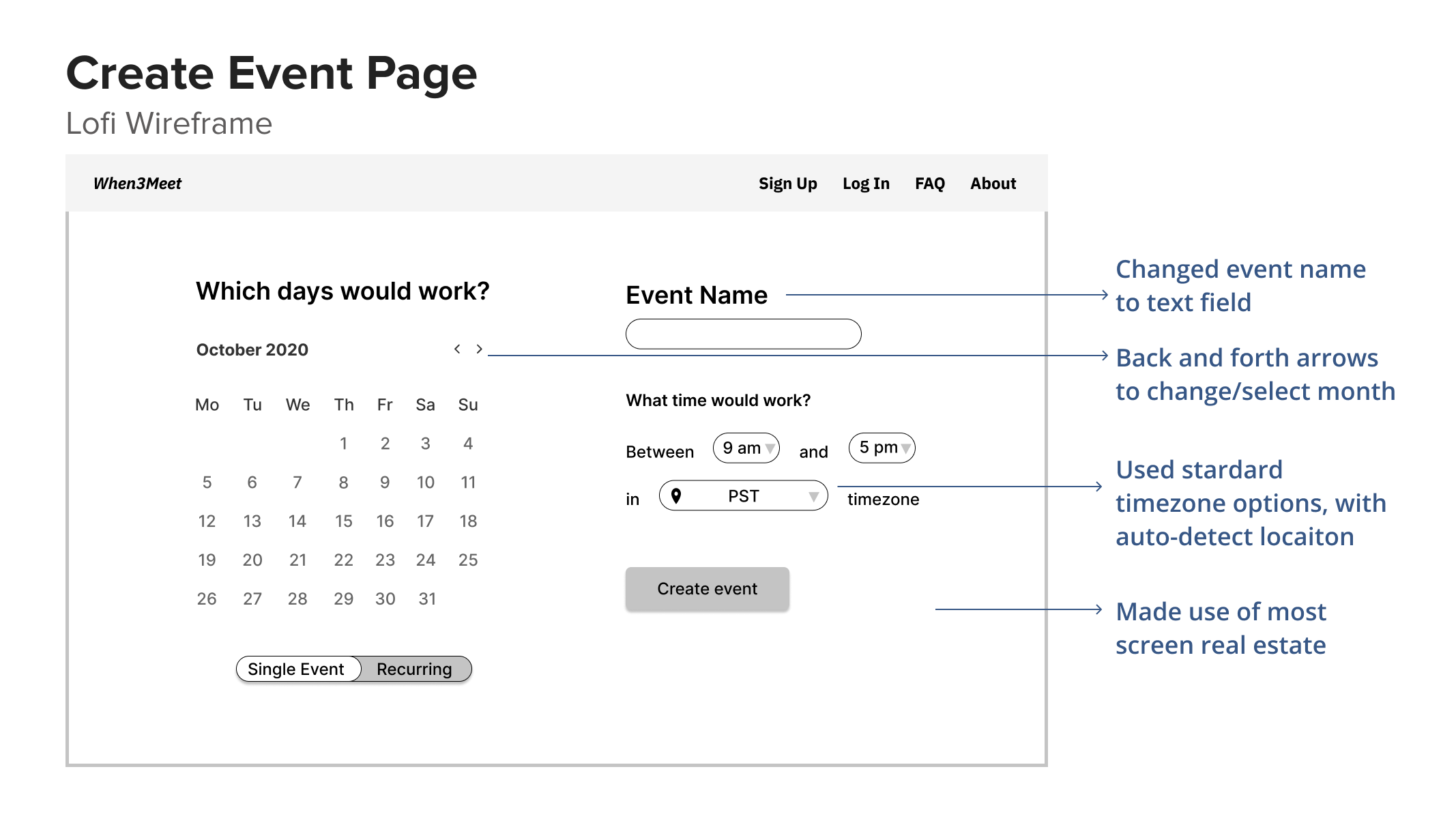
Ideation
With the design principles and requirements in mind, I started to ideate solutions. Below are a couple rough ideas I had in the process.
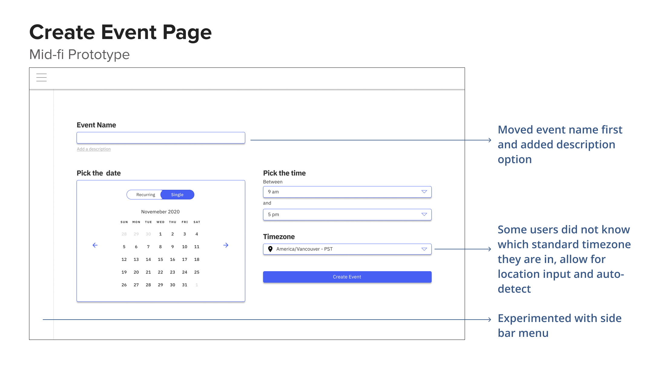
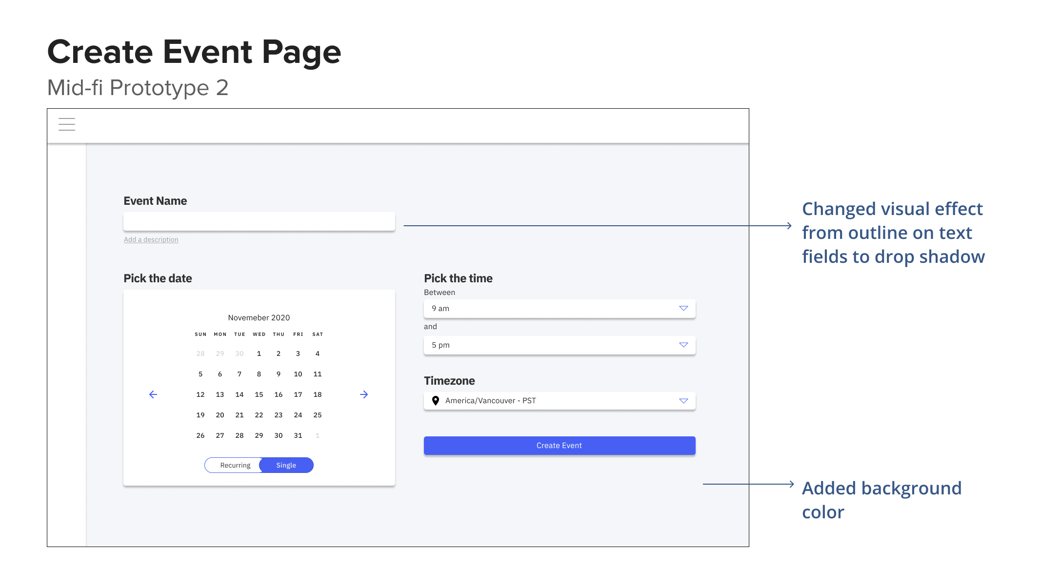
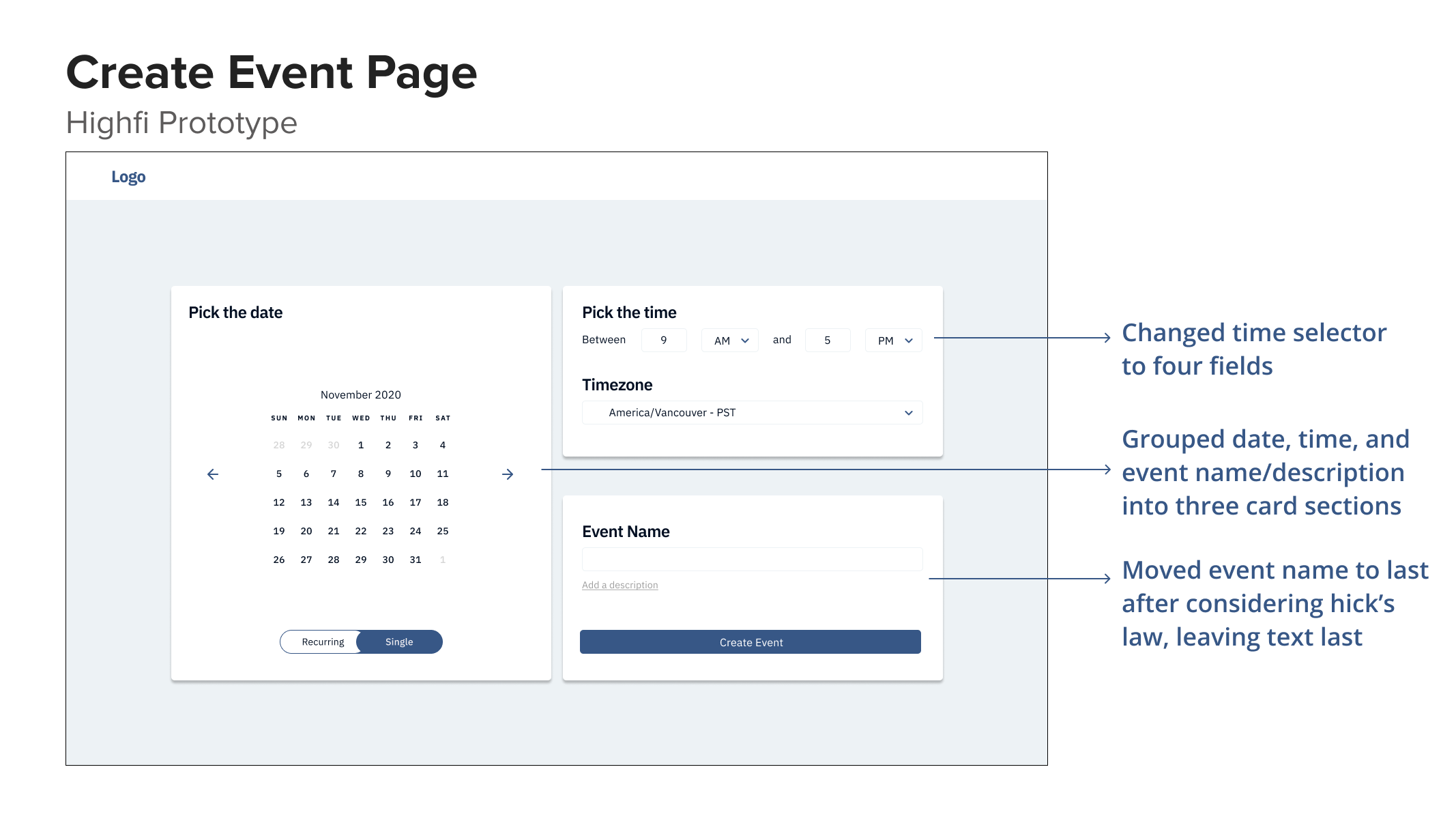
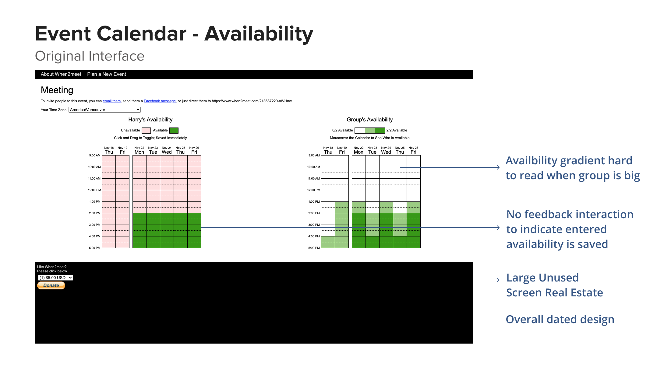
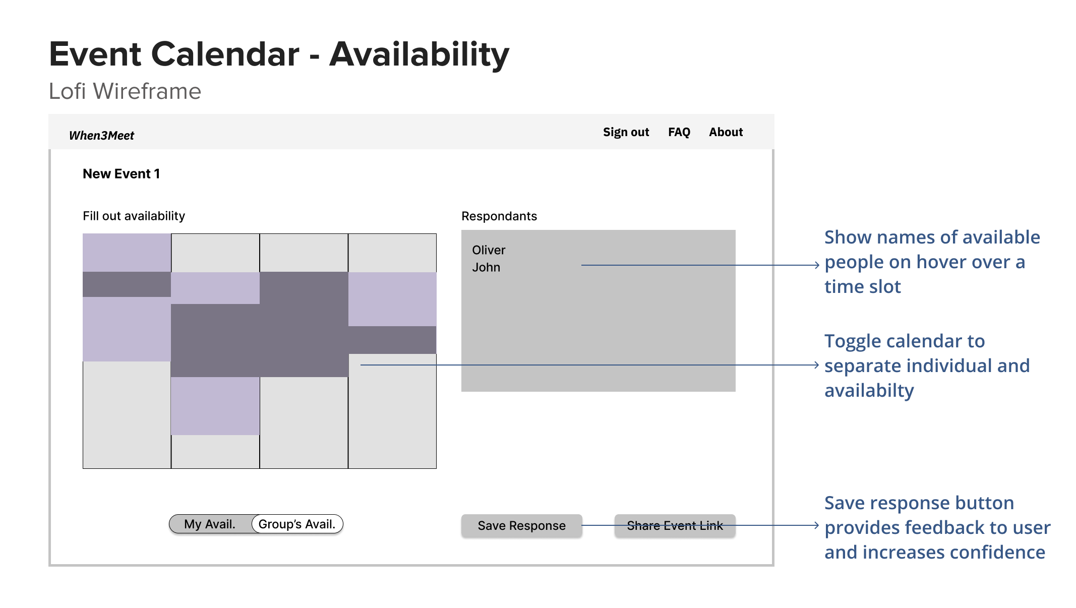
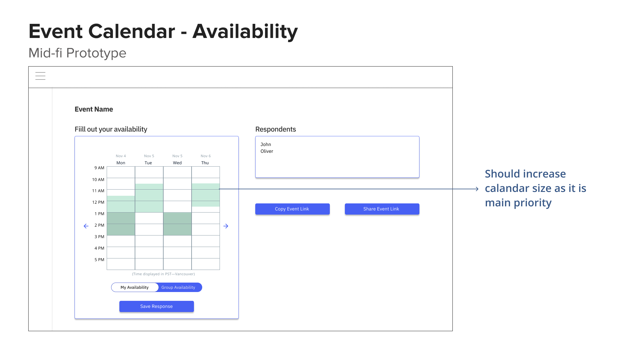
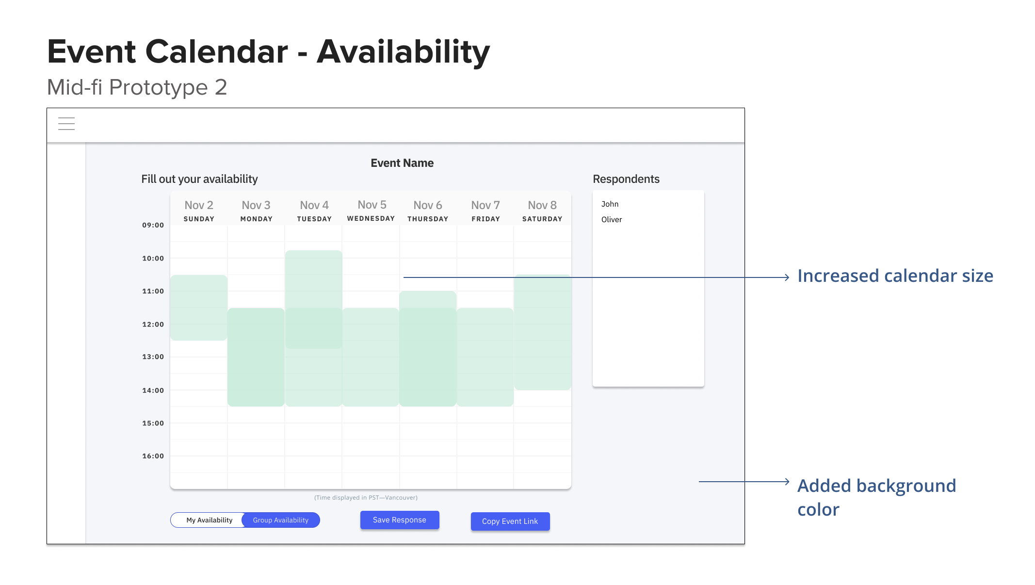
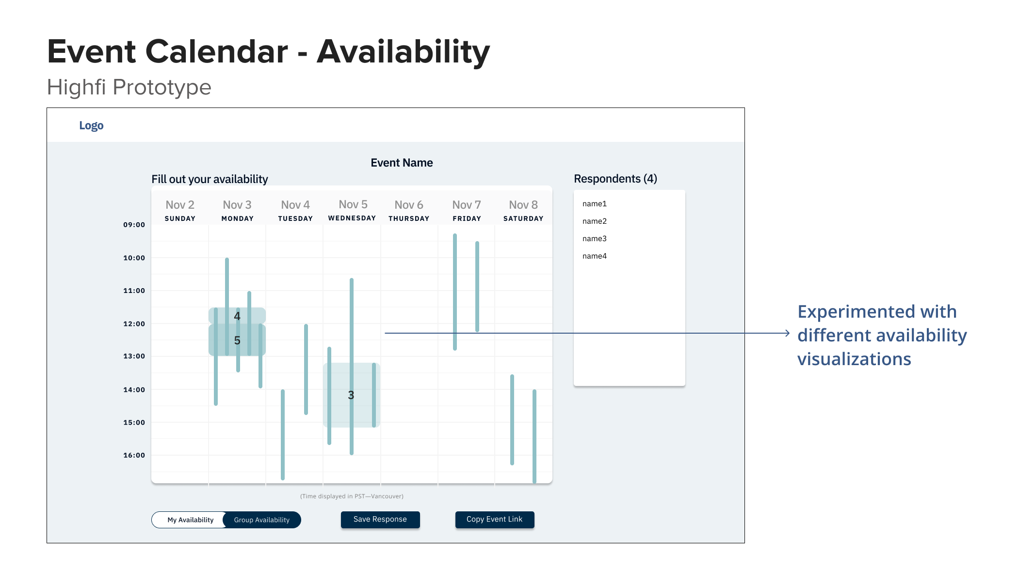
Design Iterations and User Feedback
The following is a quick overview of the iterations our design went through.
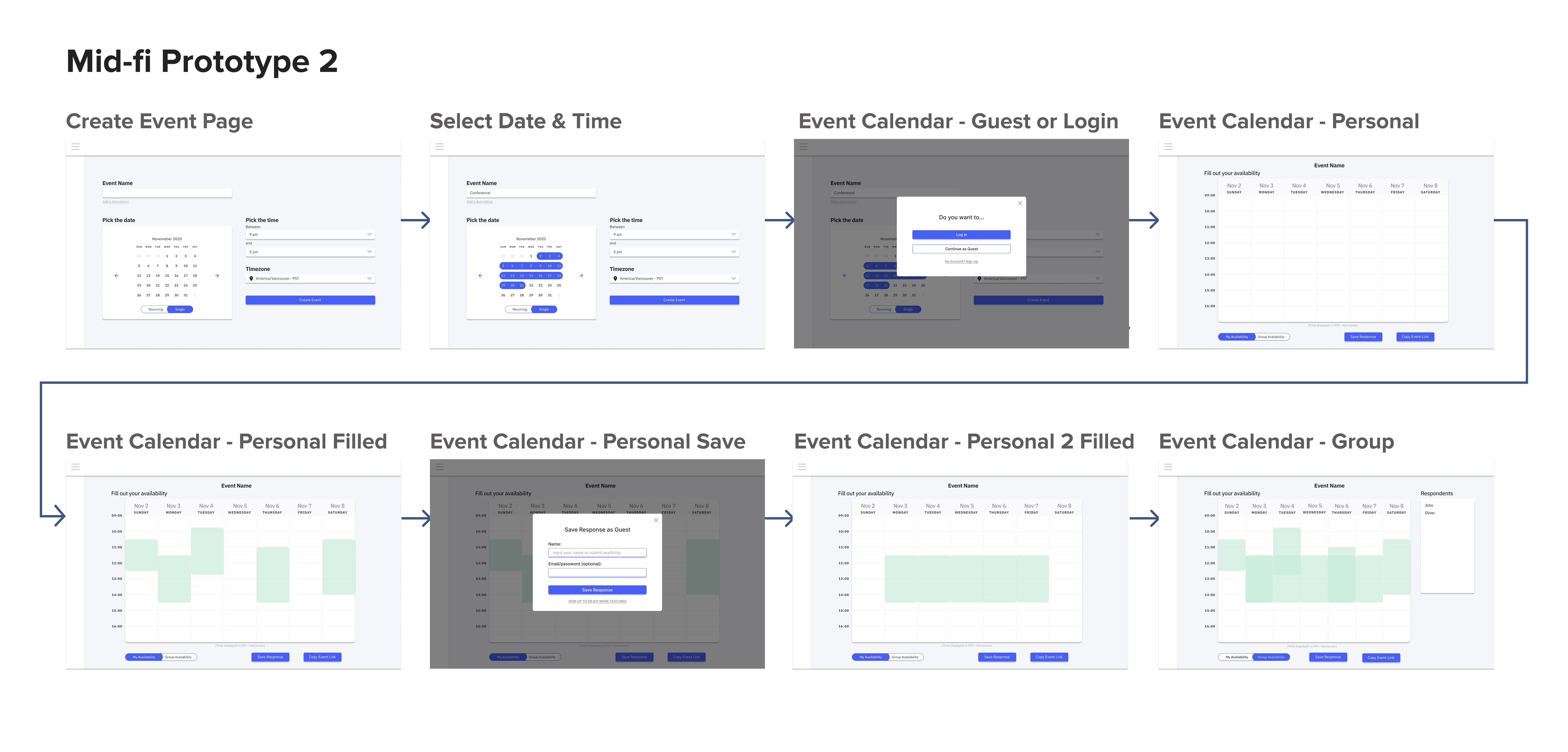
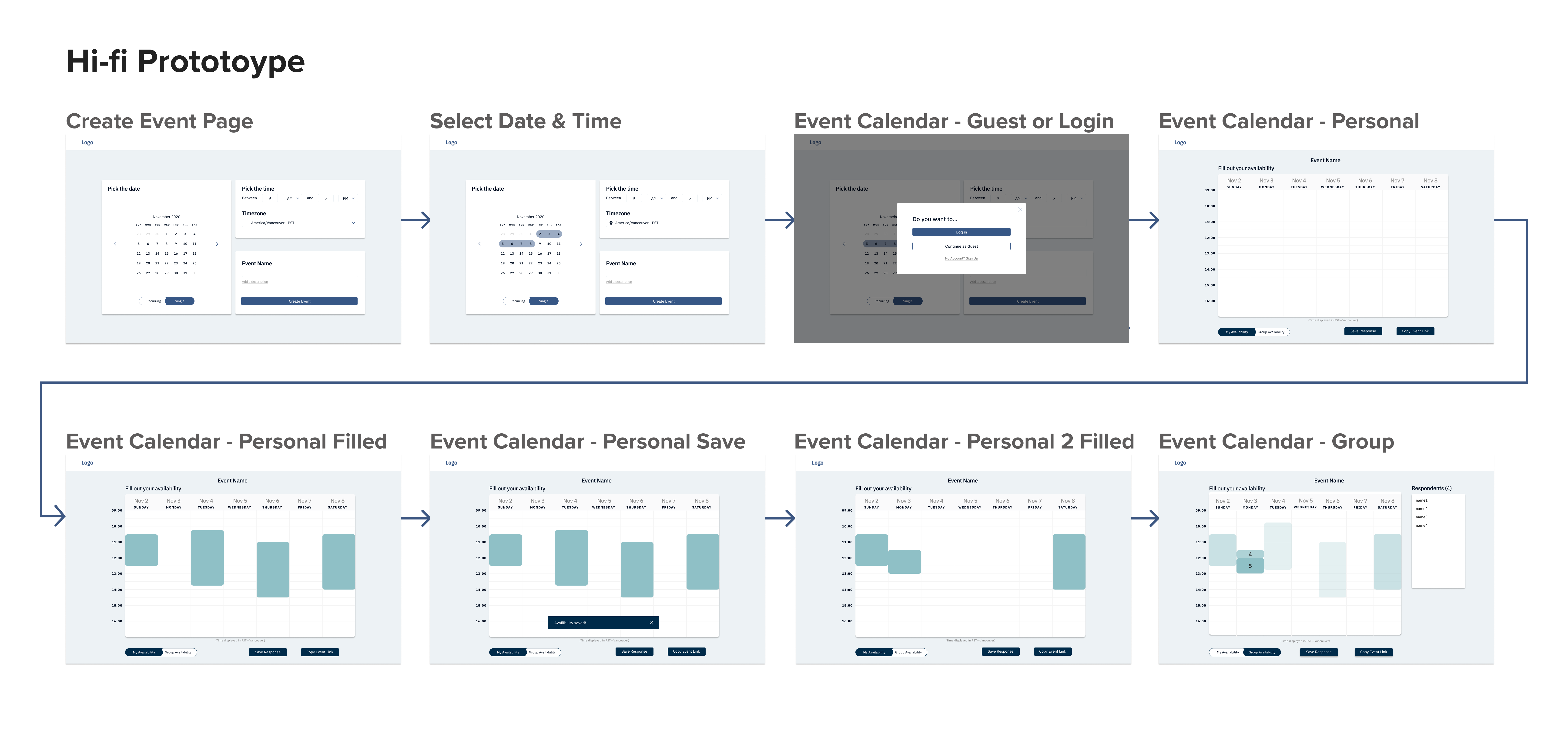
We tested with 2-3 users between each of the low-fi, mid-fi, and hi-fi prototypes. In addition, we presented our design to the team every week and received feedback which also informed some changes to the design.
The key pages that were altered the most through each iteration are summarized below:
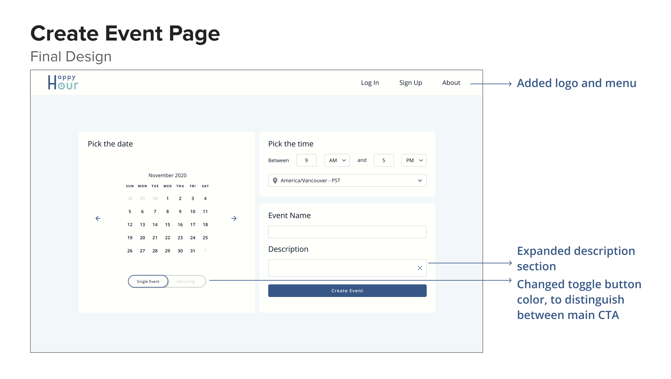
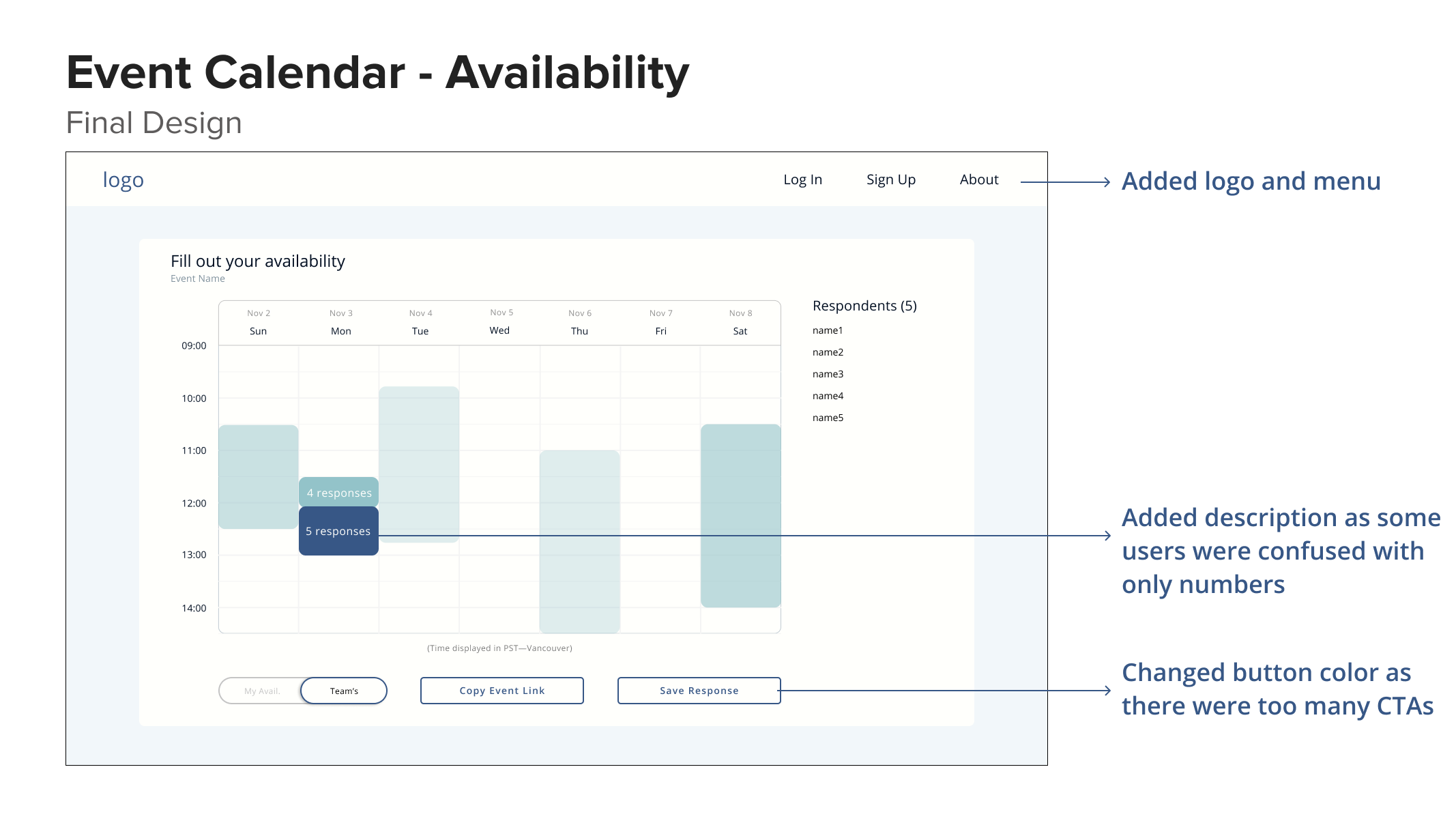
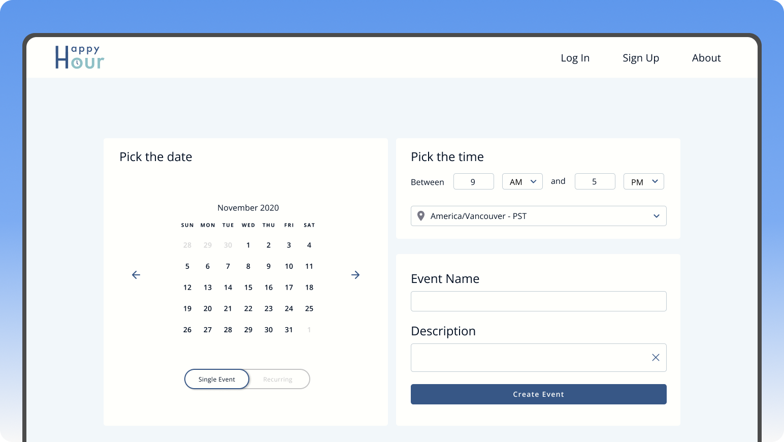
Final Design
After multiple rounds of user testing and changes to the prototype. This was the finalized design that to be implemented in development.
Reflection
What I learned
1. Advocating for research
Since I worked with a team of mostly developers, a lot of them have not really had exposure
to design or were aware of what user experience was. Thus, I tried my best to clearly explain
the importance of reason for research and presented my progress of research and design
every week to make sure the developers felt engaged in the project. As the more senior
designer on the team, I also spearheaded the design process and pushed for the features
that we build based on research data.
2. Discussing Design
In my past design experience, I was almost always the only UX designer (e.g during my
internships). So it was very refreshing to work with another designer who had a very
different perspective to bounce ideas off each other. In the early stages of the design
process, we ideated solutions separately and came together at our weekly meeting to talk
about our designs and the reasoning behind it. We almost always came with a different
perspective and it reminded me of how exciting it is to discuss design and how design
is more cohesive as a collaborative effort.
Limitations
Our research was mostly conducted within our school community (UBC), which may not be representative of other universities/colleges. Perhaps surveying and doing user research with participants from a more diverse pool would make our research and product more generalizable among the wider student population.
As time was limited, we were not able to develop all the features we wanted to add to the scheduling tool before the school year ended. This was due to the lack of time and expertise of our student developers, which is understandable as most students have a full course load, not as much experience, and other priorities to tend to. However, we were able to get the MVP running which was mostly focused on event creation and calendar schedulability.
Future Direction
If we had more time, I would have liked to test the account creation flow and dashboard visualizations. The dashboard visualizations were mainly tested on people in the team and club who already had prior knowledge of the project.
And if the product is launched, after the users have had some time to adjust and use our tool, conducting a card sort on feature priority/usefulness would be insightful to see if users actually use and value the added flexibility of synchronizing schedules etc.